

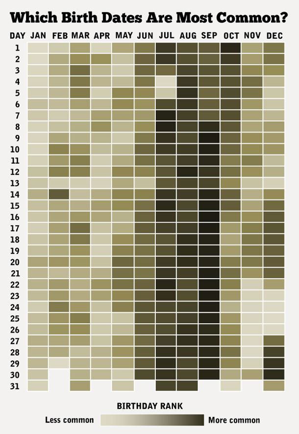
Using data from The New York Times, Matt Stiles of The Daily Viz created an interesting infographic that charts which birth dates are the most common. Inspired by the infographic, Lane Harrison created an interactive version that shows the frequencies of birth dates and conception rates from 1973-1999.
via Laughing Squid